Context-Dependent Drill Down
This module will walk you through writing a text insight that will change based on the level of granularity selected in the dashboard. Before attempting these techniques, it's important to understand how your dashboard audience can filter the underlying data in the dashboard. Check out the explainer video on Writing for Audience Interaction and the guide Using Tableau Worksheets in Wordsmith for more background. You can use these techniques to customize the level of detail in your narrative based on what the audience has selected and surface what's most relevant at the right time. In this example, we'll be writing these sentences based on what the location level that is selected in the dashboard.
If nothing is selected in the dashboard, which will also be when the dashboard initially loads, we'll write about the largest segment of data: the region.
The riskiest region is A, with $B in loans that are more than 90 days overdue.
If a region is selected, we'll write about the next level of detail: the state.
A is the state with the most risk in the B region. C% of loans in the state are more than 90 days overdue.
And if a state is selected, we'll write about the sector.
With A% of the 90-day loans in B, the C sector is the leading contributor to the risk in B.
Let's start with the first insight at the top level of our dashboard.
Calculations
We'll start by writing the calculations for all three insights, then we'll use all of those calculations in the Template. Use the Hidden Sheet Filtered worksheets for these calculations. The underlying data in that worksheet will be filtered as the audience selects things in the dashboard. So as the data changes, the insights will change. This is how we'll be able to change the insights as the audience interacts with the dashboard.
Insight #1
The riskiest region is A, with $B in loans that are more than 90 days overdue.
For this insight, we'll need to know a couple things: the riskiest region (defined by the region with the most 90-day loans) and the 90-day loan amount for that region.
Step 1: Filter
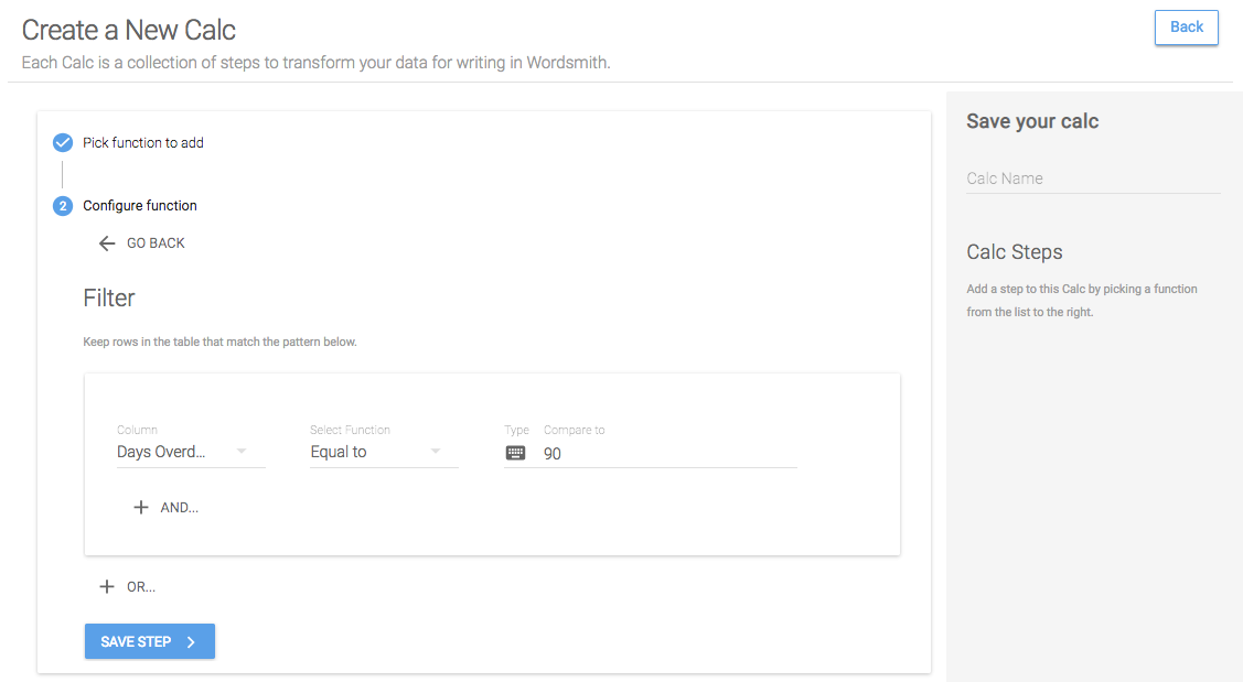
The riskiest region is the one with the most loans that are more than 90 days overdue. So we'll start by filtering the data table to just 90-day loans. To do that, we'll select Filter, then choose the Column we want to compare to, which in this case is the "Days Overdue Bin". We only want to include data when the "Days Overdue Bin" value is equal to 90. Then we'll add the function "equal to", keep the type as "value" and compare to "90".

Step 2: Group
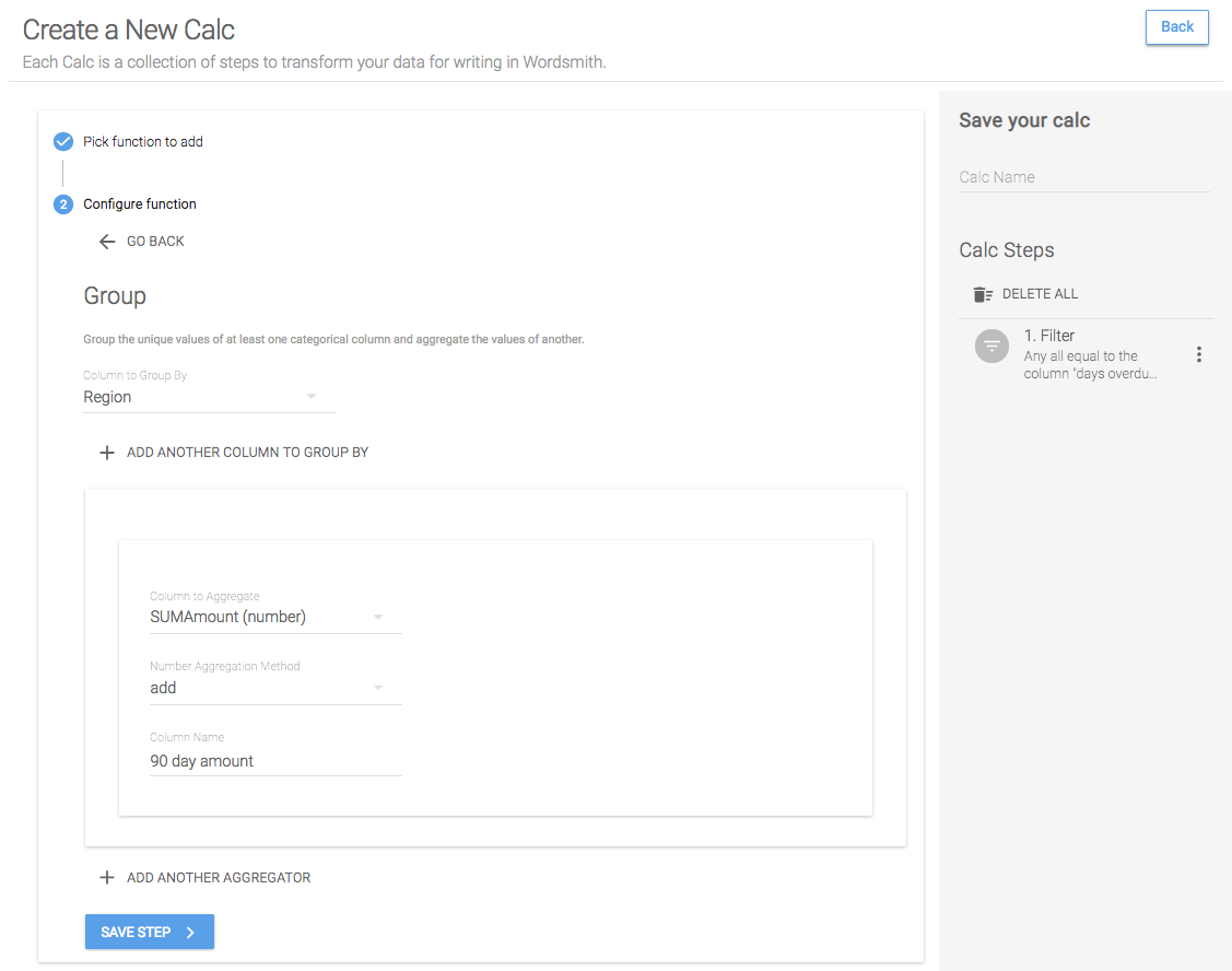
Since we're looking at the region level, we need to roll up the 90-day loan amounts to the region. We'll do that by grouping the "Region" column and by aggregating the "SumAmount" column. We want to add up all these amounts, and we'll give the new column we're creating in the table a name.
Step 3: Sort
To get the region with the highest 90-day amount at the top of the table we can use the Sort function to sort the "90 day amount" column in descending order.

Step 4: First N
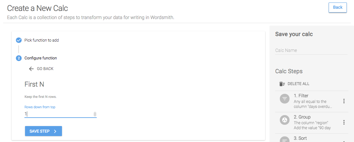
And now because the region with the highest amount of 90-day loans is at the top of the table, we can use First N to keep just the top row in the table.
Save Calc
When we save this calc, we'll have two Data Variables: the riskiest region and the 90-day loan amount for that region.

Insight #2
A is the state with the most risk in the B region. C% of loans in the state are more than 90 days overdue.
For this insight, we need to know the region that has been selected in the dashboard, the riskiest state in that region, and the percentage of loans in the riskiest state that are more than 90 days overdue. We'll be using a worksheet in which the data will be filtered as the dashboard audience interacts with the visualizations. That will allow us to know what region is selected and filter the data we use to calculate the riskiest state to just the selected region. Check out the Worksheets page for help selecting the right worksheet in your own dashboard.
Calc: Selected region
Step 1: Unique
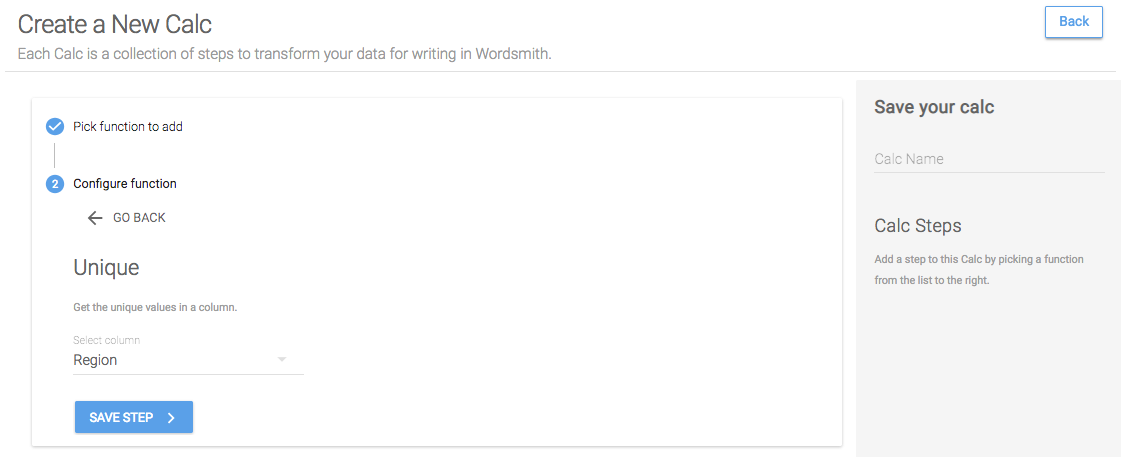
Because the data in the worksheet sent to Wordsmith will be filtered to just what's selected, we just want to create a Data Variable of unique values for the Region column. Select the Unique function and choose the Region column to just keep unique values for that column.
Save Calc
When we save this calc, we'll have one Data Variable as a list, with each region separated by a comma. If just one region is selected in the dashboard, only that one region is sent to Wordsmith, so just one region is passed in for this Data Variable.

Calc: Riskiest state
Step 1: Filter
Just like in the riskiest region calc, the riskiest state is the state with the most loans more than 90 days overdue. So we'll start by filtering the table to just 90-day loans.
Step 2: Group
Then because we want to compare this data on the state level, we'll roll up the "SumAmount" column adding all the values to get a total 90-day amount for each state.

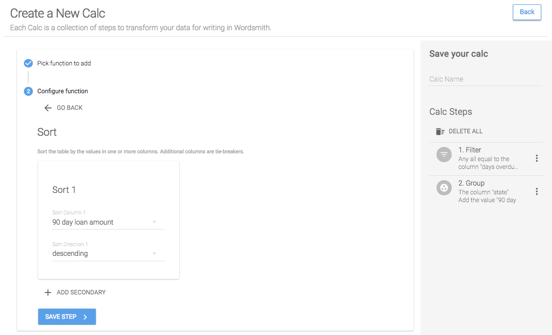
Step 3: Sort
We want to include the top state, so we'll sort this table in descending order. That will give us the state with the most 90-day loans in the first row of the table.
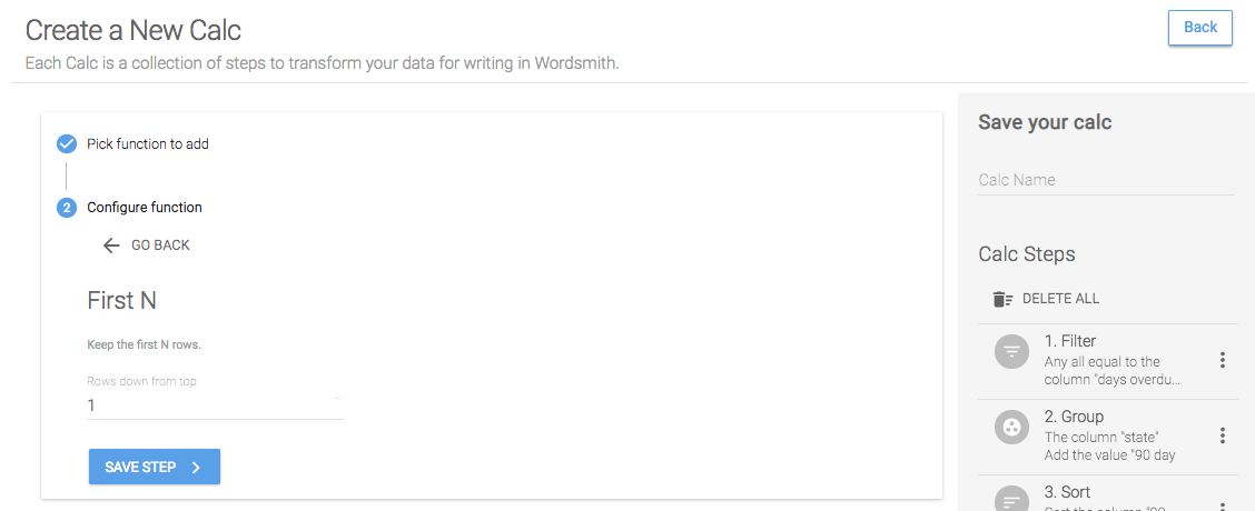
Step 4: First N
Now that the top state is at the top of the table, we'll just keep the first row by setting First N equal to 1. This will give us just the top state in the table.
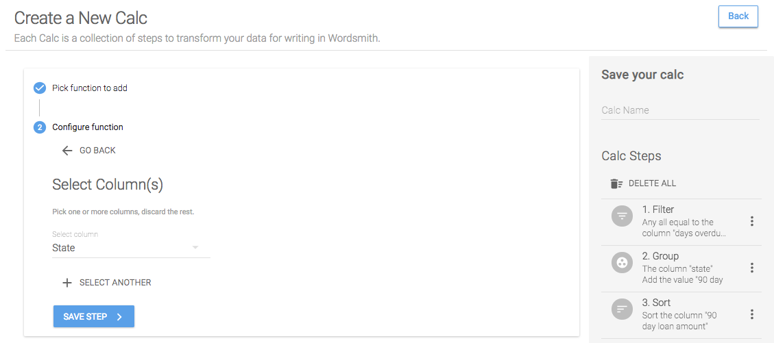
Step 5: Select
I want to use the 90-day loan amount for the top state in another calc, so I'll need to save just one column in this table at a time. To reference other calcs you've created, the table can only include one column. So first we'll select just the state column.
Save Calc
When we save this calc, we'll have a Data Variable for just the top state. Because this worksheet is filtered as the audience interacts with the dashboard, the data sent to Wordsmith will just be data for the selected region. So this calc will give us the top state in the selected region.

Calc: Percentage of 90-day loans in the riskiest state
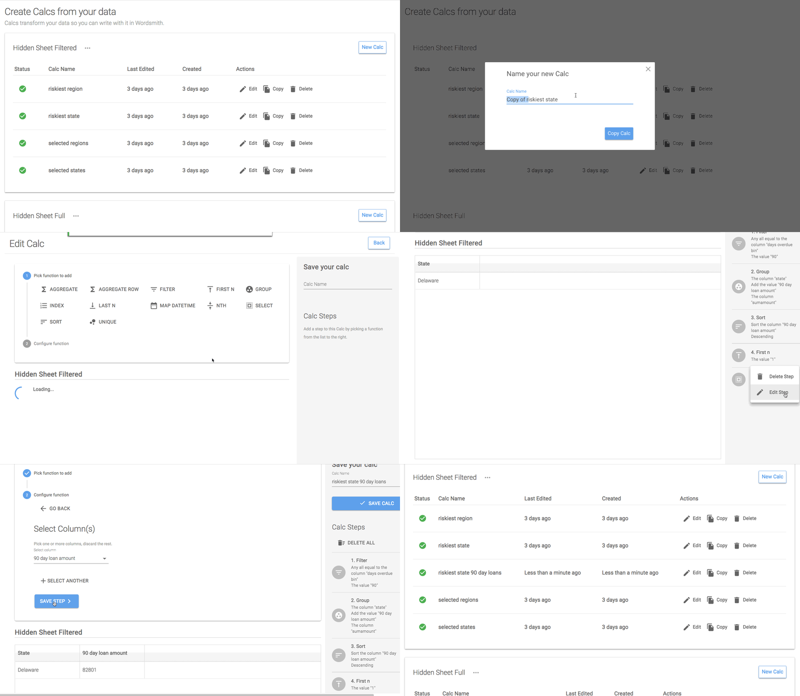
Step 1: Copy a Calc
In order to calculate the percentage of 90-day loans in the riskiest state, we need to know the 90-day loan amount and the total loan amount. The calc we just created for the riskiest state included the 90-day loans on the second to last step. We can save some time by copying that calc and changing the last step to select the 90-day loan amount.
Step 1: Filter
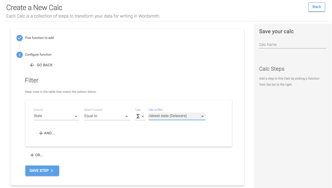
Now that we have the 90-day loan amount, we need the total loan amount for the riskiest state. To do this, we'll create a new calc and filter the table by the calc for the top state. We only want to keep data in the table where the State column is equal to the calc for riskiest state. Make sure to change the Type to Calc, and you'll see all of the calcs you've created of the same type as the column you're comparing them to.
Step 2: Aggregate
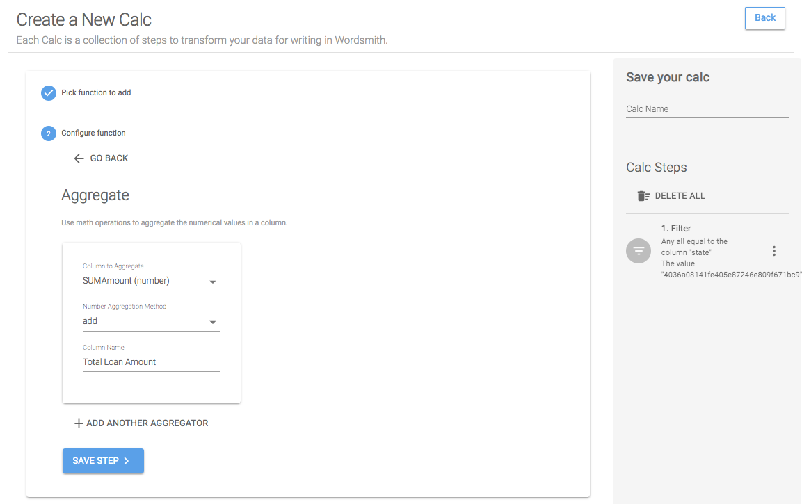
With just the top state's data in the table, we want to add up the loan amount column. To do that, we'll use the Aggregate function on the SumAmount column, setting the number aggregation method to "add", and giving the new column we're creating a name.
Step 3: Aggregate Row
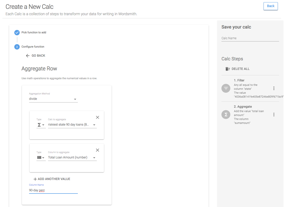
The Aggregate Row function allows us to do column and calc math. For this calc, I want to divide the 90-day amount (a calc I already have) by the total loan amount (a column in the table). So use Aggregate Row, you'll select the method, which in this case is "divide". Then we'll choose to aggregate by the calc "riskiest state by 90 day loans" and the column "total loan amount". This will give us a new column in the table.
Save Calc
When we save this calc, we'll have two Data Variables: the total loan amount for the riskiest state and the 90-day loan percentage for the riskiest state.

Insight #3
With A% of the 90-day loans in B, the C sector is the leading contributor to the risk in B.
For this insight, we need to know the state that has been selected in the dashboard, the riskiest sector in that state, and the percentage of risky loans (over 90 days) in the state that are attributed to the riskiest sector. To calculate how risky the selected state is, we can compare the state's 90-day loans to the average across all states. We'll follow similar steps for what we did with insight #2 by creating calcs for the selected state and riskiest sector within the selected state. But we'll do something different for the percentage of loans - we'll write a Formula for it in the Template.
Calc: Selected states
We'll use a filtered worksheet here because we only want to see data that has been selected in the dashboard.
Step 1: Unique
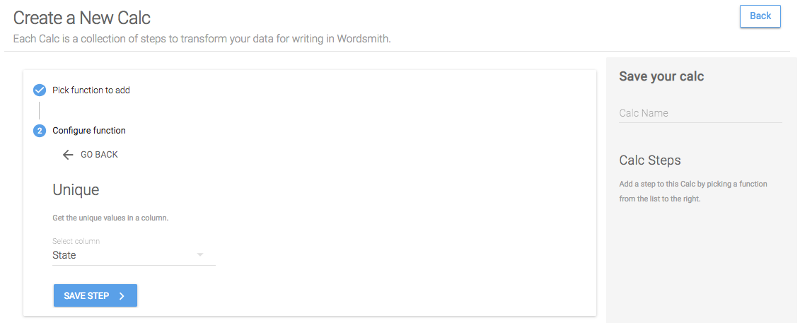
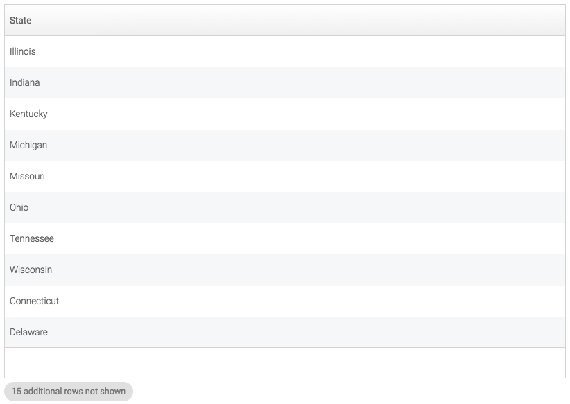
We'll do the same process to calculate the selected states that we did for the selected regions. Select the Unique function and the States column to just keep a unique value for every state.
Save Calc
Only selected states in the dashboard will be included in the Data Variable.
Calc: Riskiest sector
We'll use the same filtered worksheet for this calc because we only want to use data that has been selected in the dashboard.
Step 1: Filter
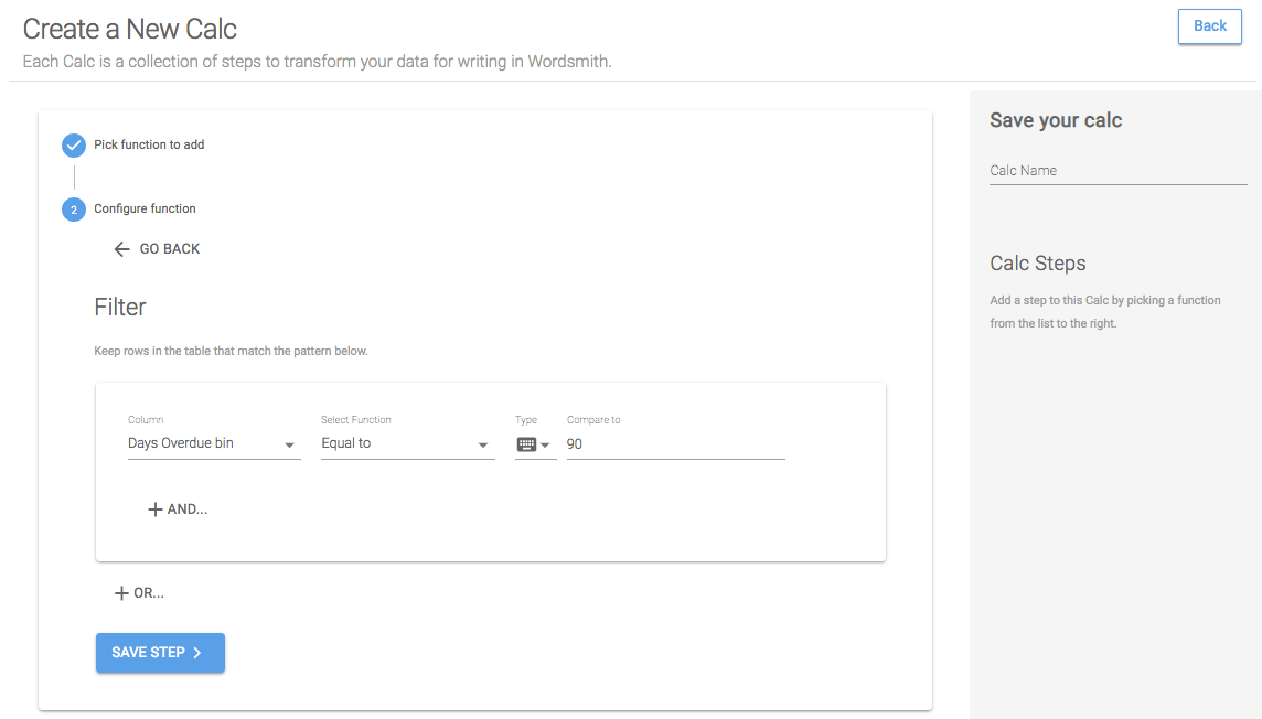
The riskiest sector is the one with the most 90-day loans, so we'll start by filtering this table down to just the 90-day loans. To do that, we want to keep data in the table in which the column "Days Overdue bin" is equal to a value of 90.
Step 2: Group
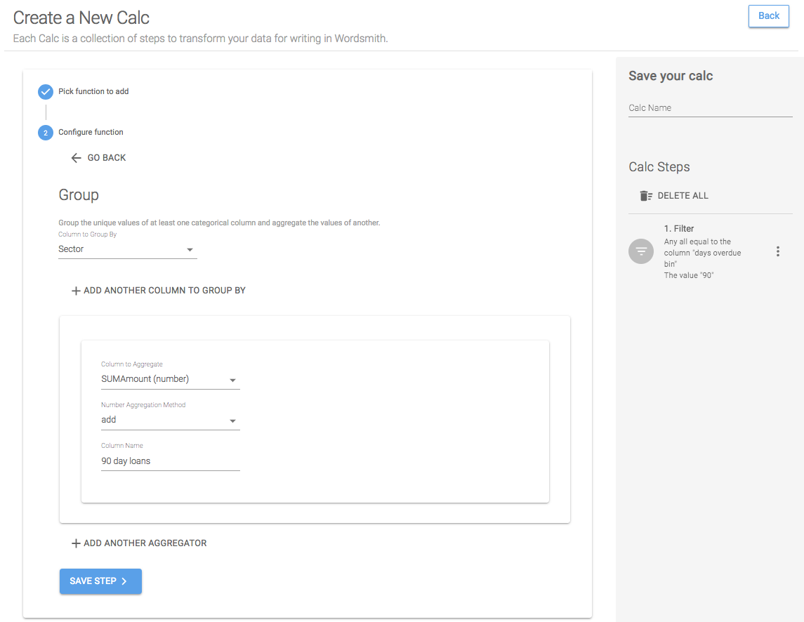
We want to compare this data on the sector level, so we'll roll up the "SumAmount" column, adding all the values to get a total 90-day amount for each state.
Step 3: Sort
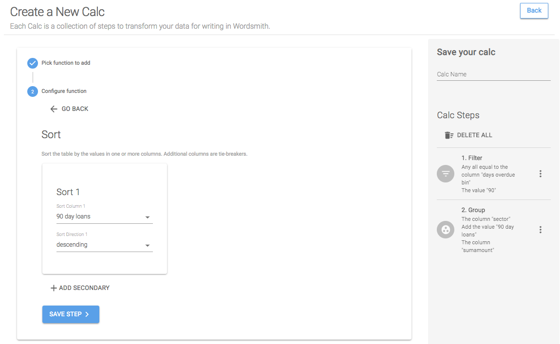
We want to know the sector with the most 90-day loans, so we'll sort this table in descending order to get the highest 90-day loan amount at the top of the table.
Step 4: First N
Set First N equal to 1 to just keep the top row in the table.
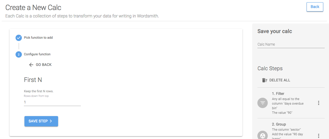
Save Calc
When we save this calc, we'll have two Data Variables: the riskiest sector and the 90-day loans in that sector.

Calc: 90-day loans for the riskiest sector
Copy a Calc
We can quickly get the 90-day loan amount for the riskiest sector by copying the riskiest sector calc and editing the last step to select the 90-day loan amount.
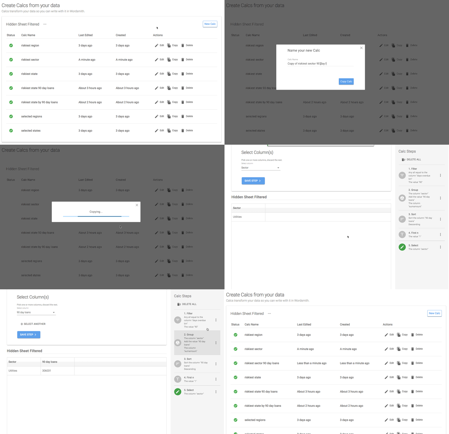
We'll use two calcs to create the percentage of 90-day loans in the riskiest sector: the 90-day loan amount for the riskiest sector and the total 90-day loan amount for the state. We could use the Aggregate Row function, but we'll do this with a Formula when we start writing the Template.
Template
Now that we have transformed the data by writing calculations, we have most of the Data Variables we need to write our insights, except for the percentage of 90-day loans in the selected state that are attributed to the riskiest sector. We're going to create that Data Variable in the Template by writing a Formula.
Creating a Formula
To do that, we'll click on "Insert Data" then "Create Formula". In the gray box, we'll select the Data Variable "riskiest sector 90 day loans", then the "divided by" function, then the Data Variable "riskiest state 90 day loans". When we save that Formula, we'll be able to treat it like any other Data Variable in the Template.
Adding Branches
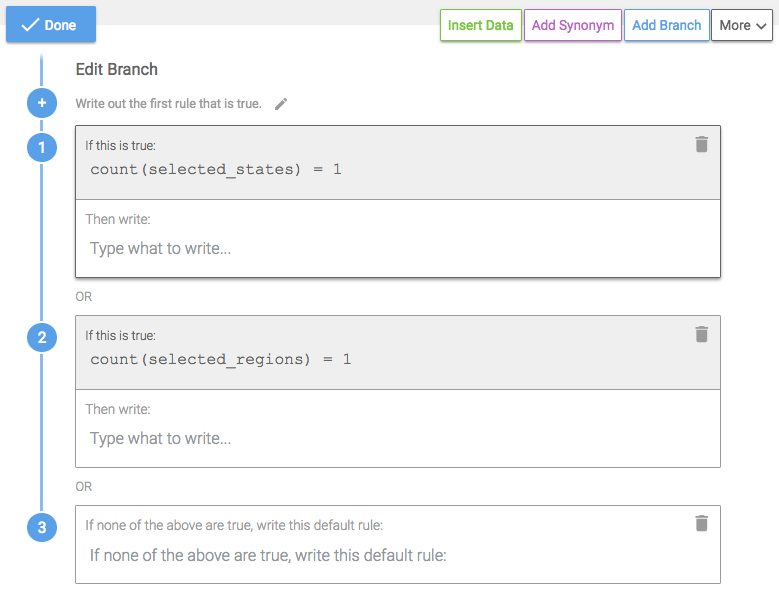
In the Branch we write in our Template, we want to change the insight based on what has been selected in the dashboard. When the dashboard loads, we want to write insight #1, when a user drills down to a region, we want to write insight #2, and when a user selects just one state, we want to write insight #3. We'll be using the selected states and selected regions Data Variables for the rules in this Branch.
Because rules in a Branch are evaluated one at a time from the top-down, we'll put the most rare or smallest level of granularity at the top of the Branch. So we'll start with insight #3, if one state is selected.
Rule 1: One state is selected in the dashboard
It's important to understand how the data in the dashboard is being filtered as the audience interacts with the visualizations. To write narrative that changes based on audience interaction, use a worksheet in which the underlying data is filtered. Check to see what data is sent to Wordsmith by selecting a worksheet and then Analysis>>View Data (or right-clicking a worksheet, then selecting View Data). If the data in the worksheet is not filtered, set up a dashboard action.
We'll be using the Data Variable "selected states", which will be a list of all the states in the underlying data. If just one state is selected in the dashboard, then one state will be passed through through to Wordsmith. Start by selected "selected states" from the drop-down in the Branch rule window. This Data Variable is a List, so we'll see the functions we can use on Lists. We want to use the count function, which will count the number of items in the List and return a number. If this number is equal to 1, we know only one state is selected.
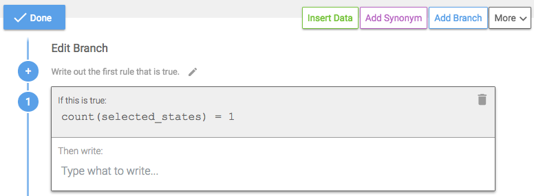
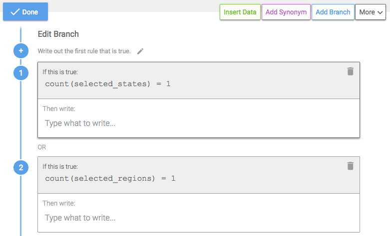
Rule 2: One region is selected
We'll add another rule for one region being selected. The logic will be the same as the first rule, but we'll use the "selected regions" Data Variable.
Default Rule
Branches are evaluated by the Waterfall Method, one at a time from the top-down, so the order of the rules in the Branch is important. If rule #1 is true, then that corresponding text is written. If rule #1 is false, then rule #2 is evaluated, and so on. If no rules are true, the default rule is written. Structure the most rare rules at the top of the Branch. The later rules can become more general because in order for them to be evaluated the preceding rules had to be false.
The only other scenario if more than one state is selected and more than one region is selected is that nothing is selected. So we'll write insight #1 as the default rule.
Inserting Data
Now that the logic in the Branch is constructed, we'll add what we want to write in those scenarios. In the first rule, if one state is selected, we want to write insight #3. As we write the sentence, we'll insert the appropriate Data Variables.
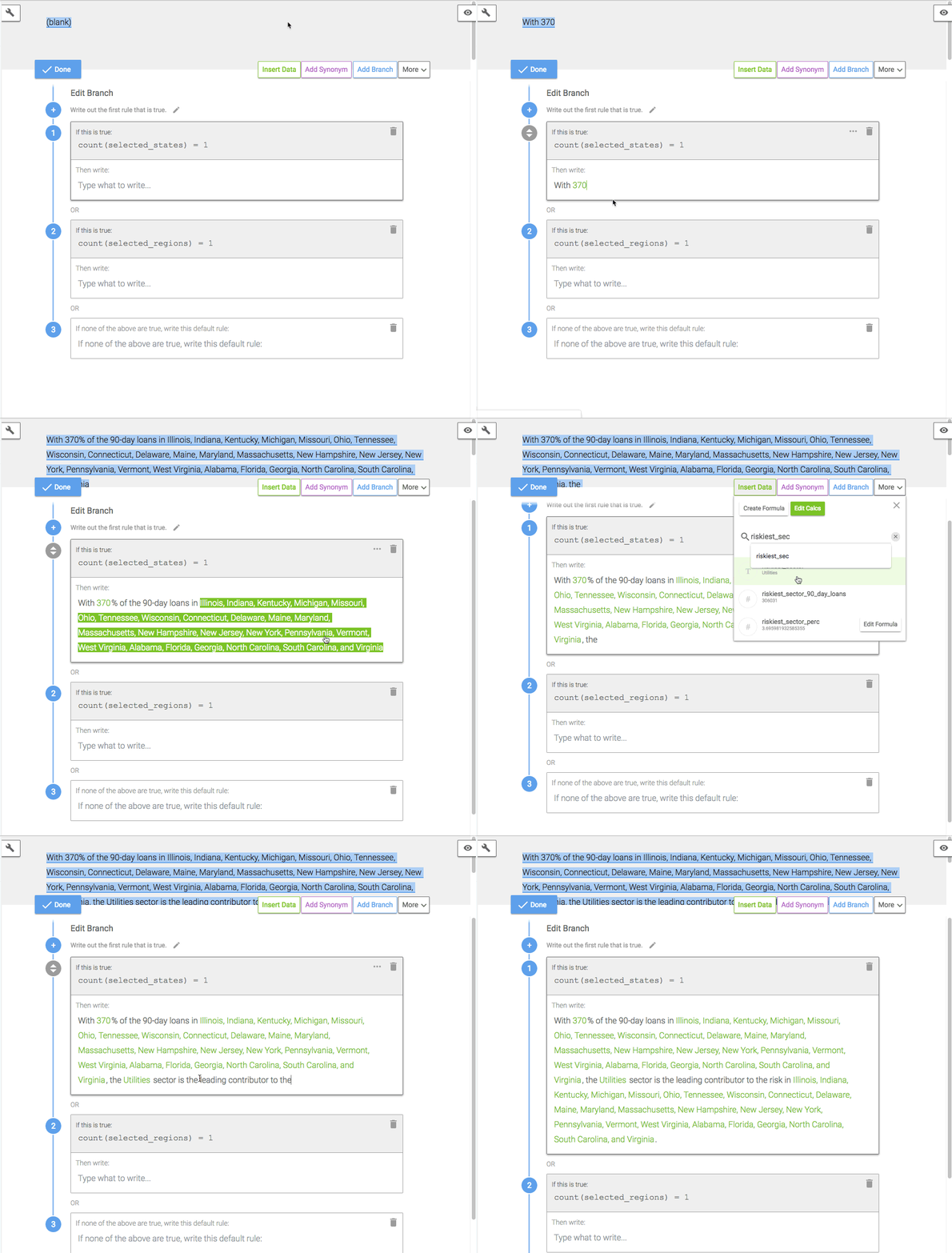
Data Variables in a Template will show an example of the data based on the data table when it was first added to Wordsmith. The examples are static and will not change in Branch logic or as the data in the dashboard changes. The examples are intended to make writing easier. To see what narrative will actually be written in different data scenarios, use the Data Tester in the toolbar on the left.
If more than one state is selected, then the first rule is false, so we'll move down to the second rule. If one region is selected, we want to write insight #2.

And if both the first and second rules are false, then we know nothing is selected, and we want to write insight #1.

Dashboard
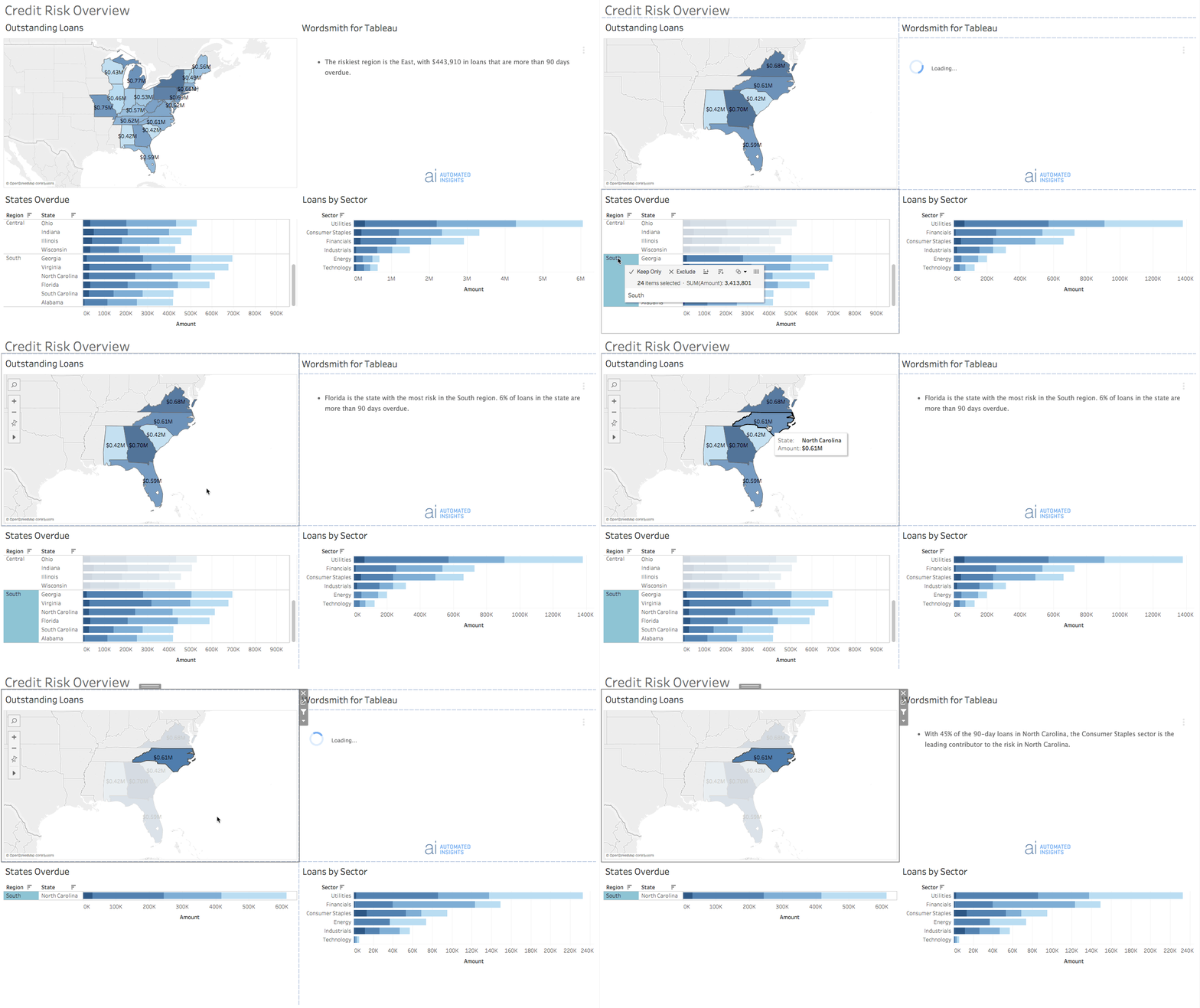
To see this Branch in the dashboard, refresh the narrative and click on a region in the States Overdue bar graph and then a state in the Outstanding Loans map.
Updated over 6 years ago
