Writing for BI
Building a Dashboard with Narrative
Designing narrative for your dashboard is similar to designing data visualizations. It's a good idea to do a little planning.
Design with a purpose
You should be able to answer these questions before getting started.
- Who is your audience and what questions are they trying to answer?
- What should your audience understand within the first 5 seconds in the dashboard and what additional information should they be able to uncover in 5 minutes?
- How should your audience use the dashboard to get the information they need?
- What do different data trends mean and why should your audience care?
Prioritize the most pertinent information
Structure your narrative to surface what's relevant to your audience at the right time.
Keep it simple and purposeful
Design your narrative with the end user in mind and make text insights actionable.
Automated Writing Process
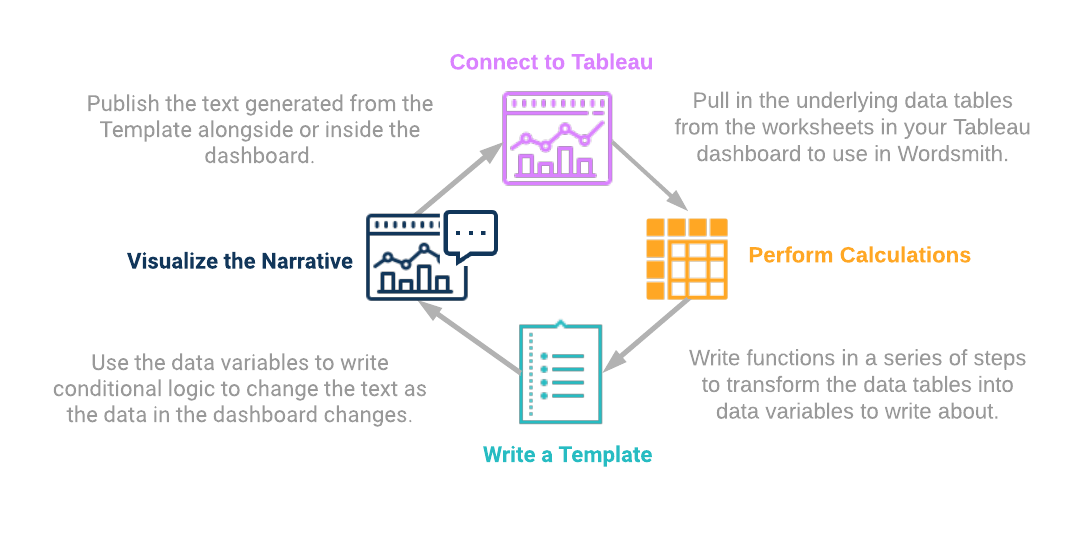
You'll likely go through these steps more than once as you build out your text insights. Start by exploring the dashboard and figuring out what you want to say.

Connect to Tableau
Think about the insights you want to write and what would add value to your dashboard. Is there a report you're currently writing by hand to explain the dashboard? Is there data that's difficult to visualize? Are there takeaways that aren't immediately obvious in a visualization or require analyzing multiple charts simultaneously?
Once you know what you want to write, consider what data you need. If you want to say a particular metric rose or fell, you'll need the current metric and what it was previously to compare to.
Perform Calculations
Use functions in a series of steps to pull out the data variables you need to write what you want to write.
Write a Template
The Template is where you'll be writing your insights. You can insert the calcs you've built (they're called Data Variables in the Template), add synonymous words and phrases, but most importantly write logic in Branches to change your insights as the data in the dashboard changes.
Visualize the Narrative
Pull the text insights you've built in your Template alongside your Tableau dashboard. You're back in the dashboard where you started, so think about the next insight you want to write by exploring the dashboard.
Markdown and HTML
Add style elements, like bullet points, bold text, or fonts, to your narrative using Markdown or HTML.
Write Meaningful Insights
Text insights are a powerful addition to a dashboard. You can use text to describe data that is difficult to visualize, highlight the key metrics that you report on, or provide a deeper explanation of your data. Think about these techniques as a way to make your text insights impactful and a value-add to your dashboard.
Role-based
Example
Head of Sales Sees
"Out of your 41 sales reps, only 10 of them exceeded the $500,000 quota, while 13 were below 50% of quota."Sales Rep Sees
"This period your sales totaled $74,814."
- Create written analytics unique to role and responsibilities
- Deliver tailored information for the right person, at the right time
- Drive understanding and engagement by limiting information overload
Descriptive
Example
“Expected revenue in Q4, when early stage deals are removed, is $540,00, which exceeds quota by $40,000.”
- Clearly describe the key points as intended by the author of the visualization
- Reduce confusion and misinterpretation of the visuals
- Save users time by delivering the main takeaways in plain text
Diagnostic
Example
"Of the 22 deals in negotiation with Q4 potential, there are 12 over $1,000 that we need to make sure cross the finish: Deal A & Deal B.”
- Reveal underlying trends not obvious in a dashboard
- Describe why things are happening, not just what is happening
- Gradually teach users how to understand the data on their own
Prescriptive
Example
"Diverting shipments from Federal Amulgated Shipping will help us attain our on-time percentage goal of 75%. Reach out to Accent on Style and Calexico Inc. to determine why their shipments have such a high average delay time and brainstorm ways to address the problems."
- Tell people what to do based on data
- Embed business rules and processes into the narrative to drive action
- Introduce feedback cycle to update and refresh suggestions
Interactive
Example
"Of the selected states, Illinois has the most risk. But overall, Illinois is not even in the top 10 of risky states."
- Listen to user selections and surface insights relevant to how they're interacting with the dashboard
- Put their selections in context by comparing to the unfiltered data
- Encourage engagement with the dashboard and teach users how to answer their own questions
Updated over 6 years ago
