Writing Your First Insight with Wordsmith for Tableau
This is a step-by-step guide on how to write your first insight using Wordsmith for Tableau.
For this guide, we'll be using a "Credit Risk Overview" dashboard that visualizes outstanding loans in the Eastern portion of the U.S.
Visit this page if you want to see a fully built demo of Wordsmith in the Credit Risk Overview dashboard. In this guide, we'll cover how to create the first bullet point insight in this demo.
Setting Up the Wordsmith + Tableau Connection
1. Navigate to the Credit Risk Overview dashboard.
Open the dashboard in Tableau Public on this page.
If your version of Tableau is 2018.1 or earlier:
Click the "Share" icon  in the bottom right of the dashboard, then copy the URL under "Link". This link is all we'll need to connect the Tableau workbook, hosted on Server, to the Wordsmith platform.
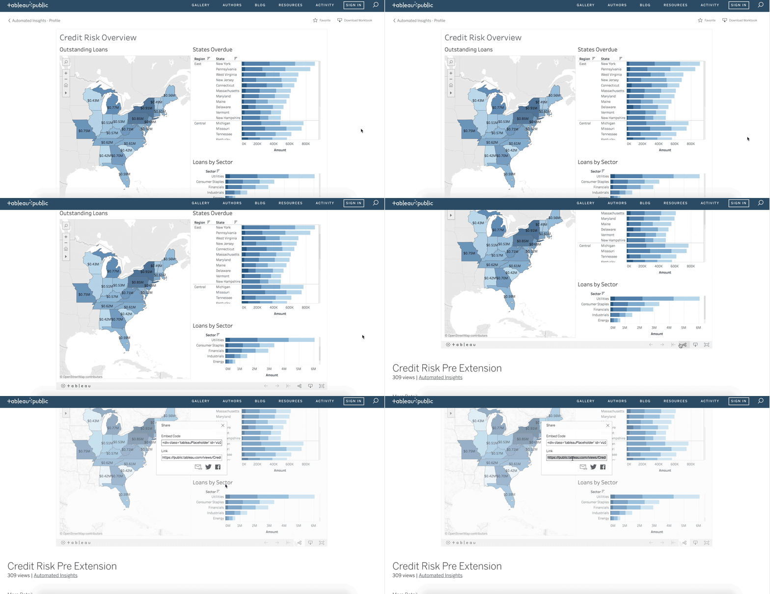
Note: if the Share box that pops up has "Current View" and "Original View" tabs, make sure to copy the Link in the "Original View" tab.
If your version of Tableau is 2018.2 or later:
- Download the Credit Risk Overview workbook from the above Tableau Public page, using the "Download Workbook" button in the bottom right corner.
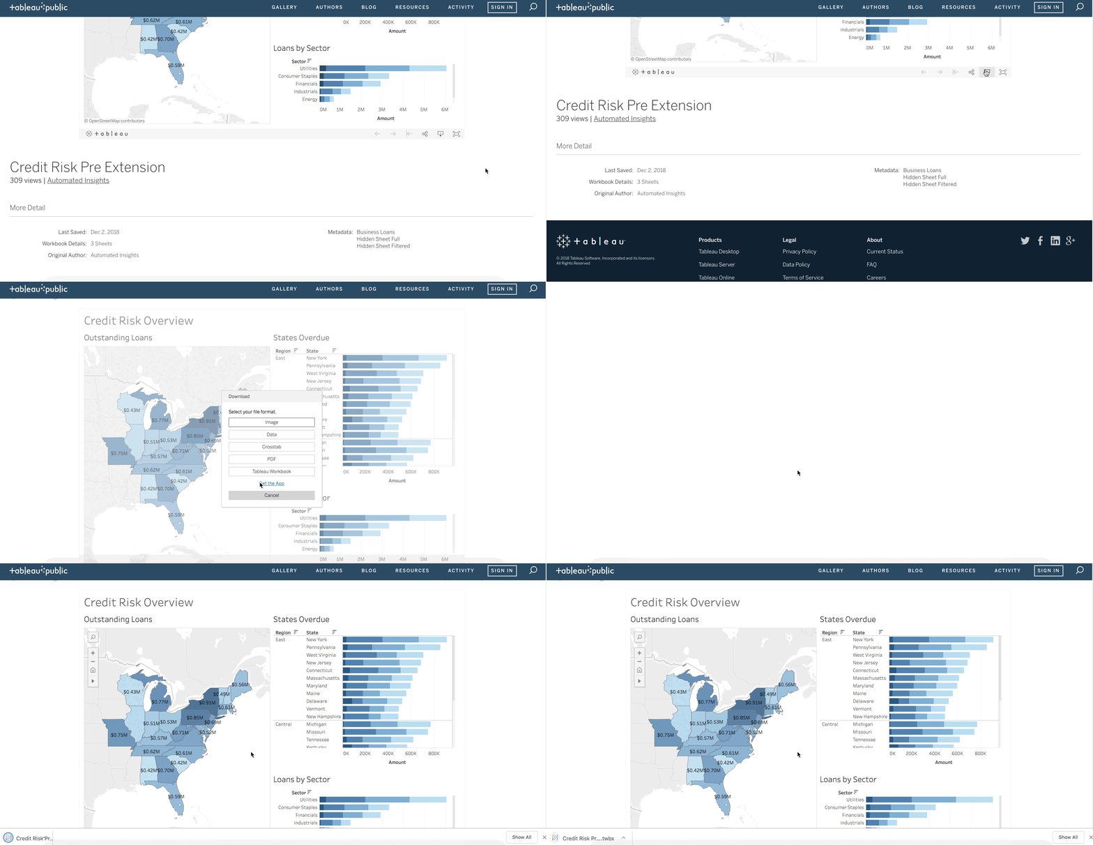
After downloading the workbook, go ahead and open it up to use in the next step.
2. Set up the Wordsmith integration.
For Tableau version 2018.1 or earlier:
- Go to Wordsmith and click the carat next to New Project in the top right corner of the page.
- Select "Connect Tableau".
- Paste the dashboard's Share link you copied in the previous section, then name your integration.
Check out more information on the Wordsmith integration here.
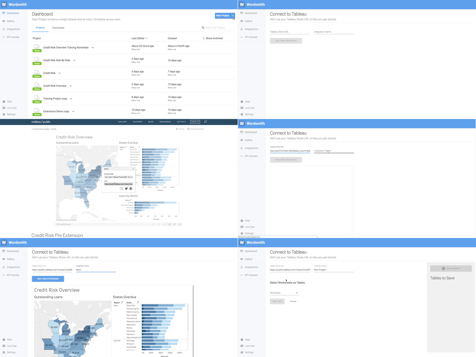
By pasting the "Credit Risk Overview" Share link, the connection between the dashboard and Wordsmith is created automatically. Once you paste the link, you will see a preview of the dashboard to validate that the connection is working.
For Tableau version 2018.2 or later:
- Download the Wordsmith Extension .trex file by clicking here. Unzip this download and make sure that the file you're using in the dashboard is .trex.
- Drag an "Extension" Object into the Credit Risk Overview dashboard. Click "My Extensions" in the window that pops up, and select the Wordsmith Extension .trex file.
- Click "Allow" when the "Allow Extension" window pops up. That's giving the Wordsmith extension access to the full underlying data in the dashboard.
- Once the Extension loads, click "Connect Account" to connect your dashboard to your Wordsmith account. You'll be prompted to enter your Wordsmith username and password, and then give your integration a name.
Check out more information on how to set up your Wordsmith Extension here.
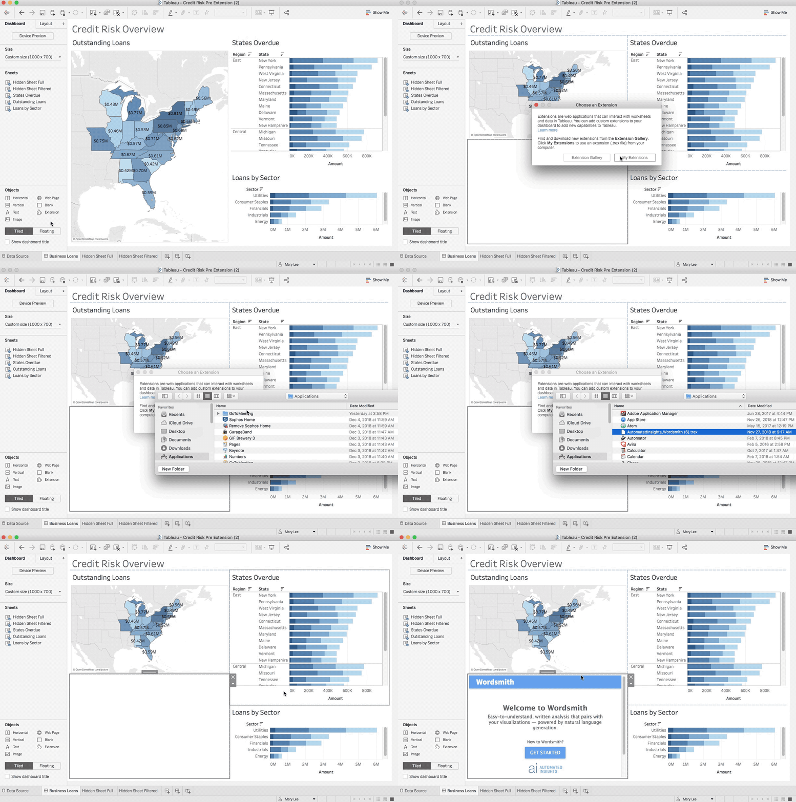
You may want to resize the Wordsmith Extension after adding it to your dashboard. Tableau Extensions are just like any other object on the dashboard, so you can move them around and change their size.
What did we just do?
We set up the connection between Tableau and Wordsmith so that data can be passed from Tableau to Wordsmith, and narrative can be passed from Wordsmith to Tableau.
If you're using Tableau version 2018.1 or earlier, then you pulled your Tableau dashboard into Wordsmith so that it can be hosted alongside the narrative generated from Wordsmith. If you're using Tableau version 2018.2 or later, then you pulled the narrative generated from Wordsmith into your Tableau dashboard.
3. Select the dashboard worksheets to pull into Wordsmith.
- Select the "States Overdue" data table. Leave “Ignore User selections” option off (un-toggled).
- Click the Save Table button.
- Then, click the Save Integration button. You're able to save your integration once you've saved at least one table.
Learn more about using worksheets in Wordsmith here.
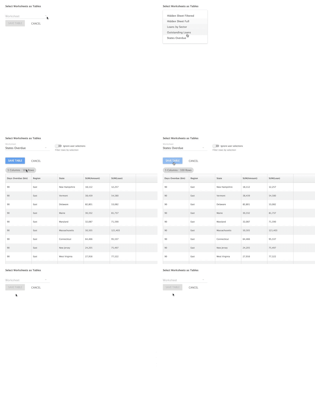
What did we just do?
We chose the worksheets from Tableau dashboard that we want to use in Wordsmith.
You have access to all of the worksheets in your Tableau dashboard, but you likely don't need all of them. You'll choose the worksheets that have the data you need to write about. And when you select those worksheets, you're turning them into data tables in Wordsmith.
4. Create a Template in Wordsmith.
For Tableau version 2018.2 or later:
- Use the three dots in the upper right corner of the Wordsmith application and select "Edit Wordsmith Template".
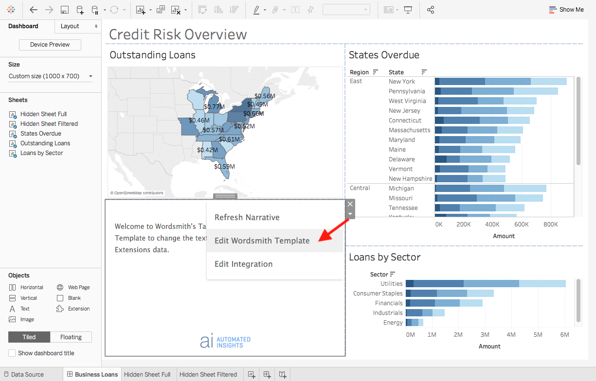
Select "Refresh Narrative" to pull in any changes you've made to your Wordsmith Template, and "Edit Integration" to add additional worksheets to your integration.
For all versions of Tableau:
You should now be in the "Write" tab, also known as the "Editor", in Wordsmith. This is where you create your Template, the narrative structure that changes the text insights based on the data in the dashboard.
There are three main components of a Wordsmith Template that empower you to create dynamic content for your Tableau dashboards: Data Variables, Synonyms, and Branches.
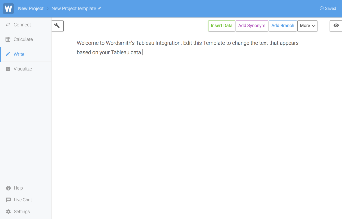
- You'll create Data Variables from the data tables you pulled from your Tableau worksheets. They're like data points that will change dynamically as the data in your dashboard changes.
- You can use those Data Variables in your Template by directly inserting them into the narrative or in the conditional logic you'll write in Branches.
- You can customize how the data in the Data Variables is displayed in your text. And the formatting options you see when you insert Data Variables are based on the type of data you're using.
- Synonyms are your way to randomly vary the text in your narratives.
- You can write in different variations of the same word, phrase, or sentence, and one option will be randomly selected for the narrative.
- If you're adding a Synonym for just one word, you'll see suggested options. You can either select one of those options or write in your own.
- Branches are the conditional logic statements, or "if-then" rules, that change what is written in your narratives based on the data in the dashboard.
- Branches are how you can change the text in your narrative as the underlying data changes or as your audience interacts with the dashboard.
- If you want to write something that's based on your data, then you can create a Branch for it. You can nest Branches inside each other, compound logic with "and" and "or" statements, and even customize how the Branch works.
5. Write your first insight.
Everything starts with what you want to write. For help determining what would be impactful narrative to add to your dashboard, check out our Writing for BI guide.
In this example, we'll start by writing this insight in our dashboard: State X has the highest amount of outstanding loans with $X.
Now consider what data we need to write that sentence. We've added the States Overdue worksheet to this integration, so we have a data table that looks like this:
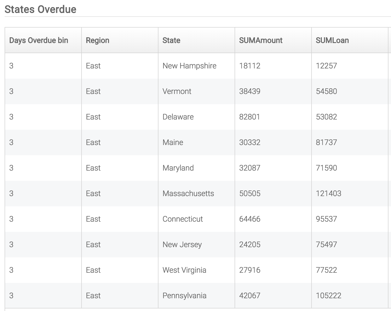
And we need to get that data table down to just two values:
- The state with the most outstanding loans
- The amount of outstanding loans in that state
To do that, we're going to write a Calc. A Calc is just a series of step-wise functions we'll perform on our data tables to pull out the data we want to write about.
Using the Calculate tab in Wordsmith
- Click on the Calculate tab on the left side of the screen.
- Click the Create New Calc button.
Now, we'll use the Calculate functions to get the state with the most outstanding loans, and the amount of outstanding loans for that state.
Group Function
- Select the Group function.
- In the "Column to group by" drop down, select State.
- The drop down for Aggregation Method should be Add already, so leave that as is.
- In the "Column to aggregate by" drop down, select SUMAmount.
- Type in a name for this new column: "Amount".
- Click Save Step.
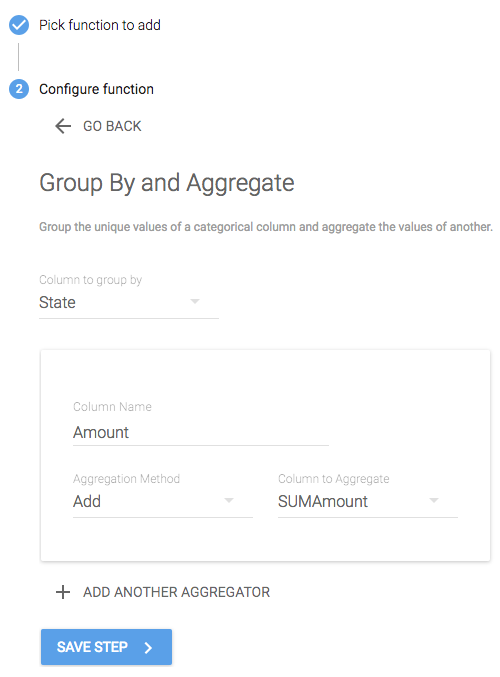
What did we just do?
The Group function allows you to roll up rows in your table.
In this example, we wanted to see the total loan amount for each state, so we chose which column in our data should be grouped. Then we chose how we wanted to aggregate the values for those groups. We chose to add up the values in the SUMAmount column. The result was each state on a single row of the table, with the total loan amount for that state.
Sort Function
- Click the Sort function.
- For the Sort Column drop down, select the "Amount" column you just aggregated.
- For the Sort Direction drop down, choose "descending".
- Click Save Step.
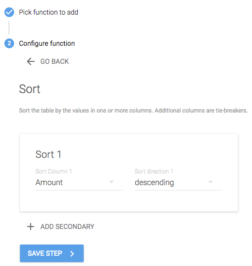
What did we just do?
The Sort function allows you to reorder the rows in the table.
Since we want to know the top state by total loan amount, we want to sort this table so that the state with the highest "Amount" is at the top of the table.
First N Function
- Click the First N function.
- "Rows down from top" should already equal “1” so we'll leave this alone. If it is not 1 by default, change the value to 1.
- Click Save Step.
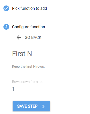
What did we just do?
The First N function allows you to just keep the top N number of rows in the table.
We only want the top state by loan amount, so we just want to keep 1 row from the top of the table. If you wanted to know the top 3 states, though, you could change that number to 3 to keep 3 rows in the table.
We have the two values we needed to pull out of this table. So we can name this calc "most loans" and click "Save Calc". Now we'll see that calc as a Data Variable in our Template.
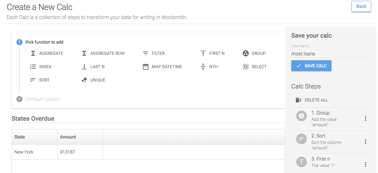
Navigate back to the Template by clicking the "Write" tab.
Now we can write our sentence and insert the Data Variables for the top state and loan amount for that state when we want to reference them.
This "most loans" calc will be sent to your Template automatically.
- Highlight “State X”.
- Click the green “Insert Data” button and select the data variable: most_loans_state.
- You have the option to change the text formatting of the Data Variable, but we can leave it as is because it's already capitalized. Click "Done", and see that the text is now green, indicating that it is a Data Variable and will change as the underlying data in the dashboard changes.
- Highlight the “X” following the $ symbol.
- Click the green “Insert Data” button and select the data variable: most_loans_amount. There are a lot of formatting options for number Data Variables, but again, we can leave this one as is.
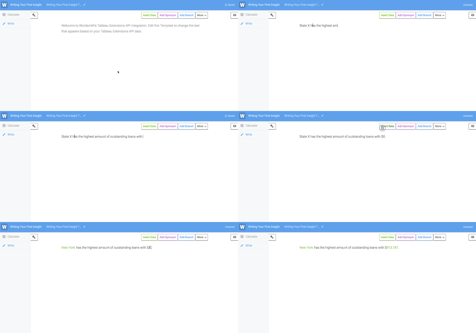
What did we just do?
Data Variables that will be updated as the underlying data in the dashboard changes.
So our insight will always write the top state based on the data. It says "New York" in the Template right now because New York was the top state in the data when we created this integration. But if the data changes, that top state will change, as well. Every time the data changes, the functions in the calc we wrote will be performed on the data table and return new values for the top state and loan amount.
6. Make the insight dynamic on dashboard interaction.
Branches are your way to change the narrative as the data in the dashboard changes. In this Credit Risk Overview dashboard, the audience can click on different visualizations and filter the underlying data. You can tell the data is being filtered by selecting something in the States Overdue visualization and looking at the underlying data by going to Analysis >> View Data or right click on the visualization and select View Data.
If you want to change the narrative as the underlying data changes from the audience interacting with the dashboard, you can write a Branch for it. In our example, talking about the state with the most loans is only relevant if the audience is looking at multiple states. But if they select just one state, then the data is filtered down to just that state, so the top state will only be the state that's selected, which isn't very helpful for our dashboard audience.
So let's write a Branch in the Template to change the narrative so that it is relevant to the audience's selection, even if only a single state is selected.
The first thing we'll need to do is write a calc for what the audience has selected.
Creating a Calc for this Branch
- Click the Calculate tab on the left.
- Create a new calc.
- Click the Unique function.
- For the "Column to search" drop down, select "state".
- Click Save Step.
- Name the calc "States" and click the Save Calc step.
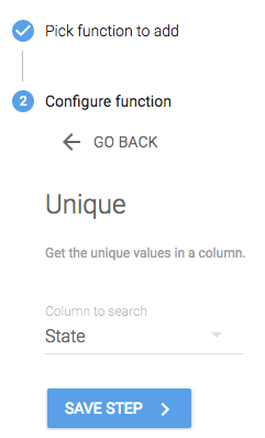
What did we just do?
The data in the table we're using is filtered to just what the audience has selected. So if the audience selects one state in the visualization, just one state will be in the data table.
The Unique function will return just the unique values in a column. And creating a calc with multiple rows in the table will turn the values from those rows into one Data Variable that is a List of items.
So we've created a calc that will just return a list of the states included in the data, which will just be the states the audience has selected in the visualization.
Setting up the Branch
- Go back the the “Write” tab.
- Highlight the entire sentence.
- Click Add Branch.
- You will prompted to add a rule in the Branch. In the box containing "If this rule is true", select the "states" data variable. In the drop down list, you'll see all the operators you can use on that data variable.
- Finish the logical rule by selecting the "count" function, then ">", and typing in "1".
- Your final rule should look like this: count(states) > 1.
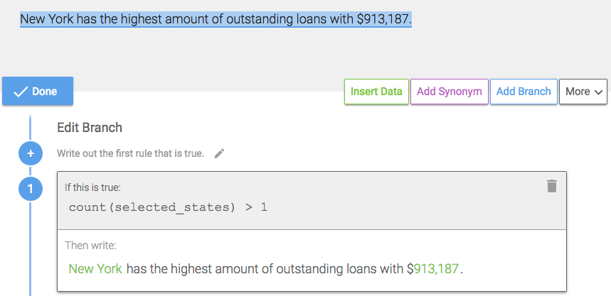
- Write another rule in this Branch in case there is only one state selected by clicking the plus sign or "Add another rule".
- This time, write the rule: count(states) = 1. You can use the drop down options or type this in manually.
- Write a new sentence and insert the appropriate data variables for most_loans_state and most_loans_amount to say: “New York had $913,187 in outstanding loans.”
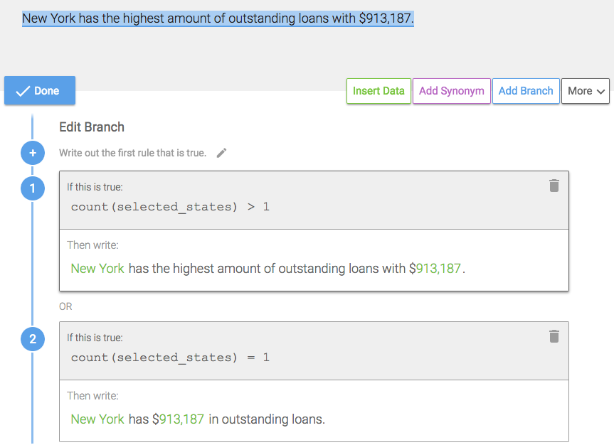
What did we just do?
A Branch will change the text in the narrative based on the logical rules written about the data. We used the Count function on a List data type to count the number of items in the Data Variable.
If the audience selects multiple states (or all of them), then there will be more than one item in the "states" Data Variable. We wrote a rule in the Branch so that if there is more than one item in the "states" Data Variable, then Wordsmith will write: "New York had the highest amount of outstanding loans with $913,187." Or if there is one item in the "states" Data Variable, Wordsmith will write: "New York had $913,187 in outstanding loans."
7. Add random variation to the text.
To randomly vary the text in your narrative, you can add Synonyms. This can be helpful if you have a dashboard where the data isn't changing often or there isn't much user interaction, but you still want the text in your narratives to sound fresh and updated.
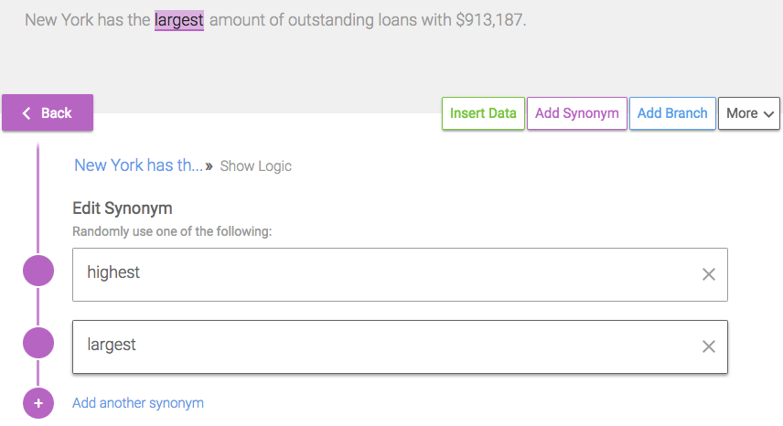
- Highlight the word "highest" in the first rule of your Branch.
- Click the Add Synonym button.
- Click “Add another synonym” and select a suggested synonym from the drop down options, or type in a variation such as “largest”.
- To add another synonym, repeat the previous step.
- Click the purple Back button, then the blue Done button.
What did we just do?
Every time you generate your narrative from the Template, Wordsmith will randomly select one of the options in your Synonyms.
So now there's a 50/50 chance that the word "highest" will be written or the word "largest" will be written.
8. Publish the insight in the dashboard.
To view the completed integration with your first insight:
Tableau 2018.1 and earlier
- Go to the Visualize tab.
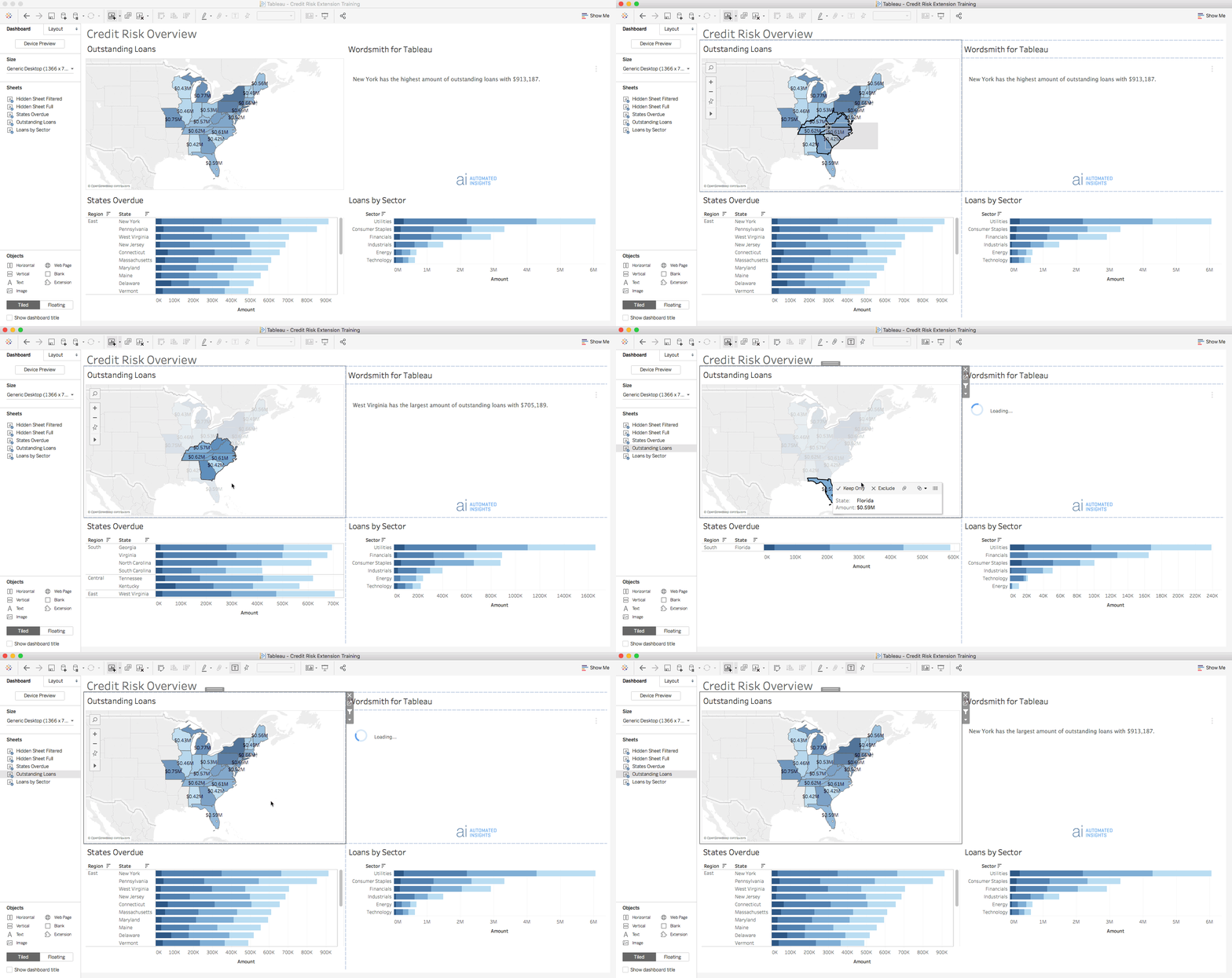
The narrative should load on the left, with the Credit Risk Overview dashboard on the right. If you drag and select multiple states in the map, the narrative will update to tell you which state (of the ones selected) has the highest/largest amount of outstanding loans, along with the loan amount.
Tableau 2018.2 and later
- Go back to your Tableau dashboard.
- From the menu inside the extension, select "Refresh Narrative".
Now, if you drag and select multiple states in the map, the narrative will update to tell you which state (of the ones selected) has the highest/largest amount of outstanding loans, along with the loan amount.
What did we just do?
We automated a narrative explaining something to our dashboard audience. The text is interactive, so as they click on the States Overdue visualization, the text will update to surface what's most relevant.
Additional Help Resources
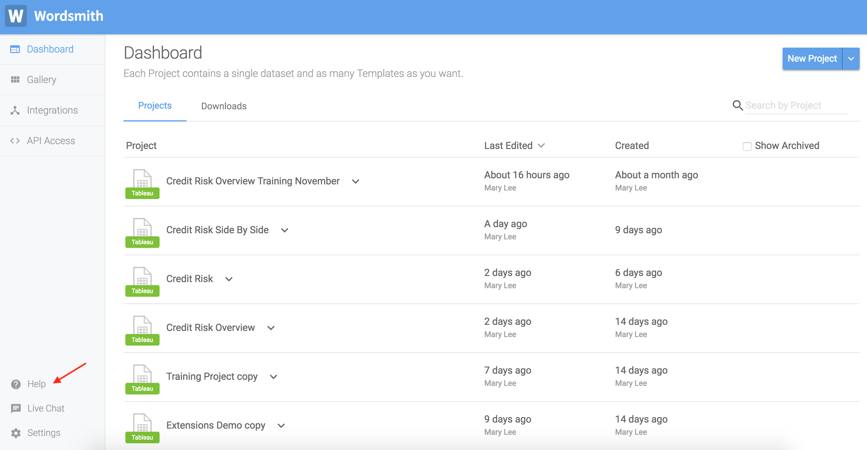
Help Tools: interactive tours, knowledge base for BI, and video tutorials that are accessible by clicking the "Help" option on the bottom-left of the menu in Wordsmith.
Check out the next module to write an insight for comparing top or bottom categories.
Updated about 5 years ago
